A Day of Storytelling at The Song Room

Originally published by me at 2017 – CogDogRoo (see it there)

I’m very fortunate that the International Specialised Skills Institute organizers of my speaking schedule suggested visiting The Song Room.

The Song Room is a national not-for-profit organisation that brightens the futures of Australia’s most disadvantaged children with tailored, high-quality music and arts programs, delivered in partnership with schools across the country.

Their work is both through in school educational programs, bringing artists into schools, and providing professional development for teachers. The reach tens of thousands of students each week and have a large amount of research to back up their efforts. They have also been active in developing a large collection of online resources and programs, ARTS:LIVE.

It’s rather impressive to see this amount of effort and support to promote arts programs in schools, especially knowing how such programs have been well gutted in the US.

So in planning this I had to do a huge <gump> to figure out what I could tell them about storytelling! I took may materials I had organized for a What Makes Storytelling Work session with a few bits added on just for The Song Room.

I was asked to share what I found exciting in technology and art. That’s a nice wide open opportunity!

A bit flashback to when the internet felt like a bubble blowing party, to what was a simple optimistic view 10 years ago, and how that is somewhat blurred in the middle in 2017.

My excitement still remains the interactive cool art things individuals have built that work in a web browser and that they are openly shared (my choices are just samples, hardly comprehensive). I tossed in my love of web serendipity, telling once again the Amazing Flower Story— which is almost exactly 10 years old.

I also shared how we might be more effective at the human scale on the big internet, rather than hoping for large scale change, using as an example the reach out to my friend Antonio in Puerto Rico. Then I added on the value of doing daily creative habits and also a few other friends, colleagues who do and share creative ideas.

Next was a talk through my various digital storytelling projects, from 50 Web Ways to Tell a Story, Five Card Flickr Stories, pechaflickr (and we did a round, they loved it). I really ran out of time before I could do much more to say about ds106 than It’s The Best thing Ever Put on the Web, and a quick description of the ds106 Assignment Bank.

I did not get to more than share the link for another collection I had assembled, a “bucket of mixable ideas”

This was a riff on the time Dean Shareski asked me if there were DS106 assignments that would work for science or math. My answer was, “not off the shelf” but it just takes a little bit of imagination for a teacher to take one and recast it to their needs.

I have examples there how the Four Icon / One Story assignment was recast by 3 elementary school teachers and how I did it myself for a session with 2nd grade students.

My idea then was to create an annotated list of digital storytelling activities organized by some larger buckets of activity types. The examples were mostly form DS106, and some other Daily ____ sites, and a few from my other projects. So it’s an Alan Centric view. But it was a useful exercise to think about the DS106 assignments in a different grouping than by media type.

After this we had an hour of discussion more about teaching and running programs online.

I really appreciated the energy and interest of this group of maybe 15+, and even more after hearing they were getting ready for an event the next day. Some 400+ kids from 8 schools who participate in the Song Room were performing at Melbourne Town Hall. Since that is just around the corner from where I am staying, I had to go see it.

It was, to be overly effusive, brilliant.

The Song Room Show
The Song Room Show flickr photo by cogdogblog shared into the public domain using Creative Commons Public Domain Dedication (CC0)

I recorded only a short bit of video from two acts, so this is but a tiny sample:

I appreciate so much the interest from Caroline, Deborah, Kirsty for organizing this, and everyone else who so genuinely welcomed me.

And then, to top off a great morning even more, I was treated to a fab lunch in the Prahan neighborhood… I had my first smashed avocado on toast. I have trended.

My First Smashed Avocado on Toast
My First Smashed Avocado on Toast flickr photo by cogdogblog shared into the public domain using Creative Commons Public Domain Dedication (CC0)

And… they gave me a fantastic bag of swag including their philosophy tea towel with words from Plato:

Such Nice Gifts from The Song Room
Such Nice Gifts from The Song Room flickr photo by cogdogblog shared into the public domain using Creative Commons Public Domain Dedication (CC0)

“I would teach children music, physics, and philosophy, but most importantly music, because music, for in the patterns of music are all arts and the keys to learning.”

And… I got a real Air Guitar, it;s all air– one of The SOng Room’s brilliant promotional campaigns — see http://playair.com.au.


Featured Image: The Song Room Show flickr photo by cogdogblog shared into the public domain using Creative Commons Public Domain Dedication (CC0)

2017 – CogDogRoo is the primary blog for my 2017 Australia Tour

from CogDogBlog http://ift.tt/2z7Dv6C
via IFTTT

Some Recent Noticings From the Jupyter Ecosystem

Over the last couple of weeks, I’ve got back into the speaking thing, firstly at an OU TEL show’n’tell event, then at a Parliamentary Digital Service show’n’tell.

In each case, the presentation was based around some of the things you can do with notebooks, one of which was using the RISE extension to run a notebook as an interactive slideshow: cells map on to slides or slide elements, and code cells can be executed live within the presentation, with any generated cell outputs being displayed in the slide.

RISE has just been updated to include an autostart mode that can be demo’ed if you run the RISE example on Binderhub.

Which brings me to Binderhub. Originally know as MyBinder, Binderhub takes the MyBinder idea of building a Docker image based on the build specification and content files contained in a public Github repository, and launching a Docker container from that image. Binderhub has recently moved into the Jupyter ecosystem, with the result that there are several handy spin-off command line components; for example, jupyter-repo2docker lets you build, and optionally push and/or launch, a local image from a Github repository or a local repository.

To follow on from my OU show’n’tell, I started putting together a set of branches on a single repository (psychemedia/showntell) that will eventually(?!) contain working demos of how to use Jupyter notebooks as part of “generative document” workflow in particular topic areas. For example, for authoring texts containing rich media assets in a maths subject area, or music. (The environment I used for the shown’n’tell was my own build (checks to make sure I turned that cloud machine off so I’m not still paying for it!), and I haven’t got working Binderhub environments for all the subject demos yet. If anyone would like to contribute to setting up the builds, or adding to subject specific demos, please get in touch…)

I also prepped for the PDS event by putting together a Binderhub build file in my psychemedia/parlihacks repo so (most of) the demo code would work on Binderhub. I think the only think that doesn’t work at the moment is the Shiny app demo? This includes an RStudio environment, launched from the Jupter notebooks New menu. (For an example, see the binder-examples/dockerfile-rstudio demo.)

So – long and short of that – you can create multiple demo environments in a single Github repo using a different branch for each demo, and then launch them separately using Binderhub.

What else…?

Oh yes, a new extension gives you a Shiny like workflow for creating simple apps from a Jupyter notebook: appmode. This seems to complement the Jupyter dashboards approoach, by providing an “app view” of a notebook that displays the content of markdown cells and code cell outputs, but hides the code cell contents. So if you’e been looking for a Jupyter notebook equivalent to R/shiny app development, this may get you some of the way there… (One of the nice things about the app view is that you can easily “View Source” – and modify that source…)

Possibly related to the appmode way of doing things, one thing I showed in the PDS show’n’tell was how notebooks can be used to define simple API services using the jupyter/kernel_gateway (example). These seem to run okay – locally at least – inside Binderhub, although I didn’t try calling a Jupyter API service from outside the container. (Maybe they can be made publicly available via the jupyterhub/nbserverproxy? Why’s this relevant to appmode? My thinking is architecturally you could separate out concerns, having one or more notebooks running an API that is consumed from the appmode notebook?

Another recent announcement came from Google in the form of Colaboratory, a “research project created to help disseminate machine learning education and research”. The environment is “a Jupyter notebook environment that requires no setup to use”, although it does require registration to run notebook cells, and there appears to be a waiting list. The most interesting thing, perhaps, is the ability to collaboratively work on notebooks shared with other people across Google Drive. I think this is separate from the jupyterlab-google-drive initiative, which is looking to offer a similar sort of shared working, again through Google Drive?

By the by, it’s probably also worth noting that other big providers make notebooks available, such as Microsoft (notebooks.azure.com) and IBM (eg datascientistworkbench.com, cognitiveclass.ai; digging around, cognitiveclass.ai seems to be a rebranding of bigdatauniversity.com).

There are other hosted notebook servers relevant to education too: CoCalc (previously SageMathCloud) offers a free way in, as does gryd.us if you have a .edu email address. pythonanywhere.com/ offers notebooks to anyone on a paid plan.

It also seems like there are services starting to appear that offer free notebooks as well as compute power for research/scientific computing on a model similar to CoCalc (free tier in, then buy credits for additional services). For example, Kogence.

For sharing notebooks, I also just spotted Anaconda Cloud, which looks like it could be an interesting place to browse every so often…

Interesting times…

from OUseful.Info, the blog… http://ift.tt/2jeoV6b
via IFTTT

El Puente de Puerto Rico: A Bridge of Postcards

Are you stressed, tired in the middle of your semester?

Imagine your classrooms, campus, students not even sure if they have water, electricity, food, much less internet, just because the place they live was twice in the path of hurricanes. Imagine you are a citizen of the United States of America and hear its leader blame you for this problem, and not delivering a fraction of the aid seen in Texas and Florida.

Imagine your syllabus when, as university professor teacher, your are hoping just to contact students, and figure out how to continue classes.

Imagine.

Like several of my colleagues, I have been very worried about our friend, colleague Antonio Vantaggiato (@avunque), and relieved when he was finally able to message us that he was okay.

Antonio has been a generous soul in our field, arranging for me a slot at the TEDx event he organized plus a month long fellowship he arranged for me at Universidad del Sagrado Corazon.

I don’t think he bumped into Zuck’s avatar.

A few people have been asking how we can help, and Antonio is working to come up with some needs and suggestions.

As a very small thing I thought we could do now, I suggested we start a campaign of mailing postcards to he and his students just to say, that unlike our President…. we care.

Send a postcard to Antonio and hist students at Universidad de Sagrado Corazon

It’s really simple. Do you know what the postage is to mail to Puerto Rico? Easy, the same as mailing something to me in Arizona or some clown in Washington DC. You seek, Puerto Rico is in the United States of America (someone mail that to the clown).

That is 34 cents to mail from the USA to the USA.

So I am asking as many people as possible to send a We Care About Puerto Rico postcard message to:

Also, some things Antonio and I have talked about:

  • We will plan a DS106 Daily Create on Wednesday October 18 as another way to send a message of care.
  • Ask people to tweet messages of support with #care4sagrado and/or any of his course tags: #inf103 or #inf115 or #inf1034 or #inf1037
  • As Antonio teaches his courses via blog syndication http://inf103.com/ and http://inf115.com/ (where you can already see some posts like Rebuilding after Maria), he’s thinking about setting a way people could blog messages to his students via RSS feeds
  • We are thinking about doing a podcast / storytelling project about teaching and learning under these conditions

These are small, but as Antonio and his university develop their continuation plans, we will wait until he can share some more specific needs of his students.

In my month in Puerto Rico, I experienced an overwhelming amount of friendliness, generosity, and spirit despite what were challenging conditions before the Hurricane. And I am horrified by the tone and lack of empathy our President is sending out; he does not speak for me.

I’d like to think a pile of postcards might let our friends and fellow US citizens in Puerto Rico know that others feel like me.

As I was scrambling to find a first card to send, I ony had a few left from some old movie postcards I bought last year. But the one I did pull was for the movie El Puente de Waterloo (The Waterloo Bridge) — so with some editing via Sharpee pen, I want to declare it as part of a Bridge of Care to Puerto Rico.

from CogDogBlog http://ift.tt/2xGOsv8
via IFTTT

Collaborative Annotations You May Want to Join

woman and 2 kids read on couch

I am always on the lookout for collaborative hypothes.is annotations – articles or sites out there that others have put out calls to annotate. I do this for three reasons:

  1. I can use them as examples in workshops I give to faculty about annotation, and I noticed my colleague use them in individual consultations with faculty to showcase the tool;
  2. I like to use them in my class so my students get to see the global potential of collaborative annotation; and
  3. For my own professional development – I discover interesting reading material and it makes reading less lonely and often a richer experience, like an asynchronous reading group.

Here are some that are worth looking into:

#MarginalSyllabus

Marginal Syllabus “convenes and sustains conversations with educators about issues of equity in teaching, learning, and educations via collaborative web annotation using Hypothes.is. They organize monthly annotatathons taking place over a certain period of time (usually a few days) and you can know ahead of time which articles will be annotated on which dates. Check out their entire  2017/2018 syllabus here and you can plan to invite your students or colleagues ahead of time. Most recently, they’ve been annotating work on participatory culture in conjunction with the DML Conference.

Online Teaching Manifesto

If you work anywhere near the area of online teaching and have not seen the University of Edinburgh’s digital education team’s  Online Teaching Manifesto, you should probably take a look at it now. Creativity in the Open is an event organized by Tania Dorey-Elias which has a virtual “before workshop” component – including annotation of the Online Teaching Manifesto (on the conference site) and it already has a lot of rich annotations.

The Copenhagen Letter

I recently heard of the Copenhagen Letter (again, if you work in edtech and have not read this, you probably should) and decided to annotate it in class with my students and invite others to participate as well. This also has an interesting conversation going on.

Annotating Privacy Policies #DigCiz

Earlier this summer, the team doing #DigCiz proposed to annotate the privacy policy of Slack. I think this is a really useful exercise, and a way to help us all think critically about the terms of service and privacy policies of different tools we use – sometimes looking at how others have annotated a privacy policy will point us to things we had not noticed on our own (these documents are often inhospitable in terms of jargon and length, but can seem less daunting when you see how others are responding to them).

Are there interesting recent/upcoming annotatathons that you know of? Tell us in the comments

“Book Club– The Big Wave” flickr photo by betsywatters http://ift.tt/2xC0ztt shared under a Creative Commons (BY-ND) license

Return to Top

from ProfHacker http://ift.tt/2kJKuvX
via IFTTT

10 Brutalist Websites to Inspire Your Next Web Design Project

Web design trends change all the time. By the time you find a designer you can work with, decide on a look everyone can agree with, get the work done, and finally go live, what’s cool and fresh and trendy has changed. Enter brutalist websites.

What’s that, you ask? It’s when you buck the trends and purposefully design your website to be ugly. And if it’s not straight-up ugly, it’s at least free of frivolous/superfluous design elements.

Brutalist websites are a relatively new thing among purposeful designs, but a lot of them draw inspiration from the early days of the internet. The days when Angelfire and Geocities were the pinnacle of awesomeness. The days when the only HTML you needed to know were a href and img src.

The web has moved on since then, but good (or maybe good-bad?) design hasn’t. On one hand, brutalism is about function over form. If it works, let it work. On the other, it’s about being punk af and making the user work for whatever they get out of your site.

No matter which way you wanna go with it, I’m sure you can find a way to brutalize your next design project after you’ve checked out these glorious monstrosities.

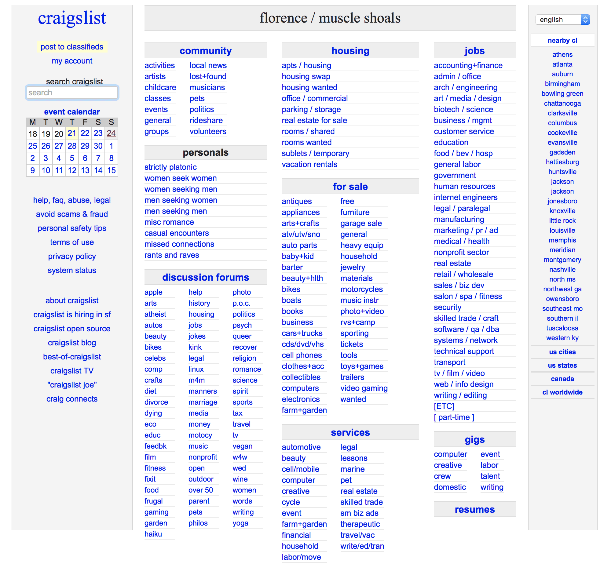
1. craigslist.org

brutalist websites

Y’all, Craigslist is ugly. No, don’t defend it. It’s a monster. Black text, blue links, white background. It’s not pretty. But it doesn’t have to be.

Because it works. That’s what is important. Part of brutalism is UX, and CL has that down. You can find what you need to buy or sell without any fuss or muss or extraneous moving parts.

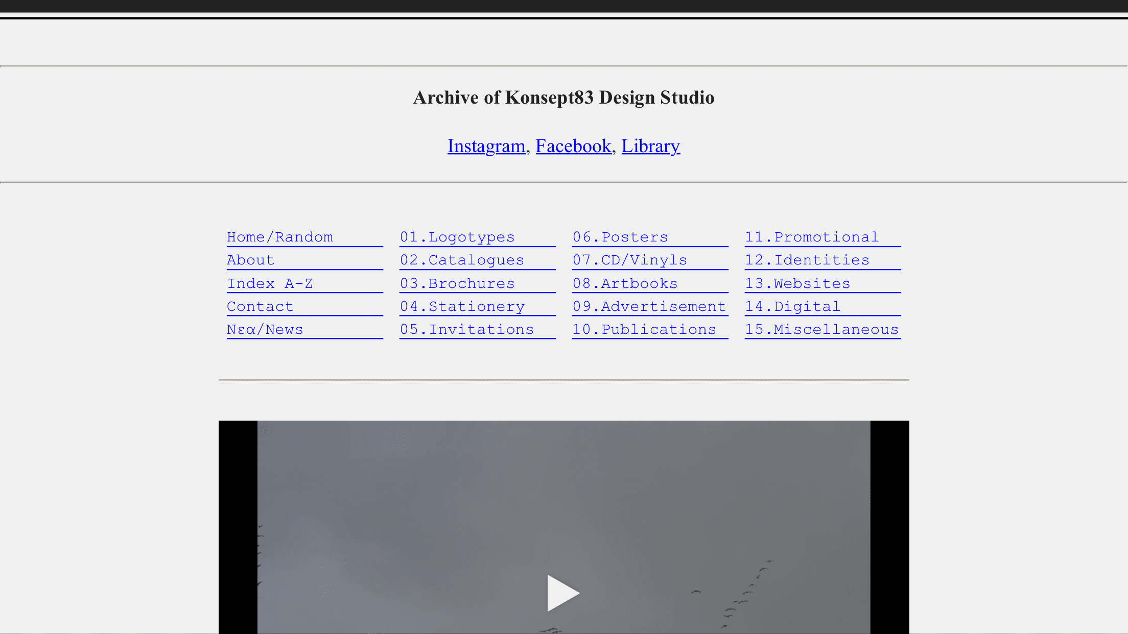
2. Konsept83.com

brutalist websites

Like Craigslist, Konsept83 looks to the early days of the internet for inspiration. Grey background, typewriter font (a brutalist website staple), and all the links that spell out precisely what you’re clicking into.

The interior pages are just as spare–they just have images embedded.

3. pictureshow.tv

brutalist websites

Pictureshow.tv only works in landscape mode on mobile (or on desktops). It’s a video series designed to look and feel like an old VHS tape. You even click into the other pages, and they act like they are VCR setup menus.

But you know what? The site works, you know what to do, and you’re not lost for a moment.

But man. It’s ugly. And beautiful at the time time. And the best part is that you have no question about how to use it.

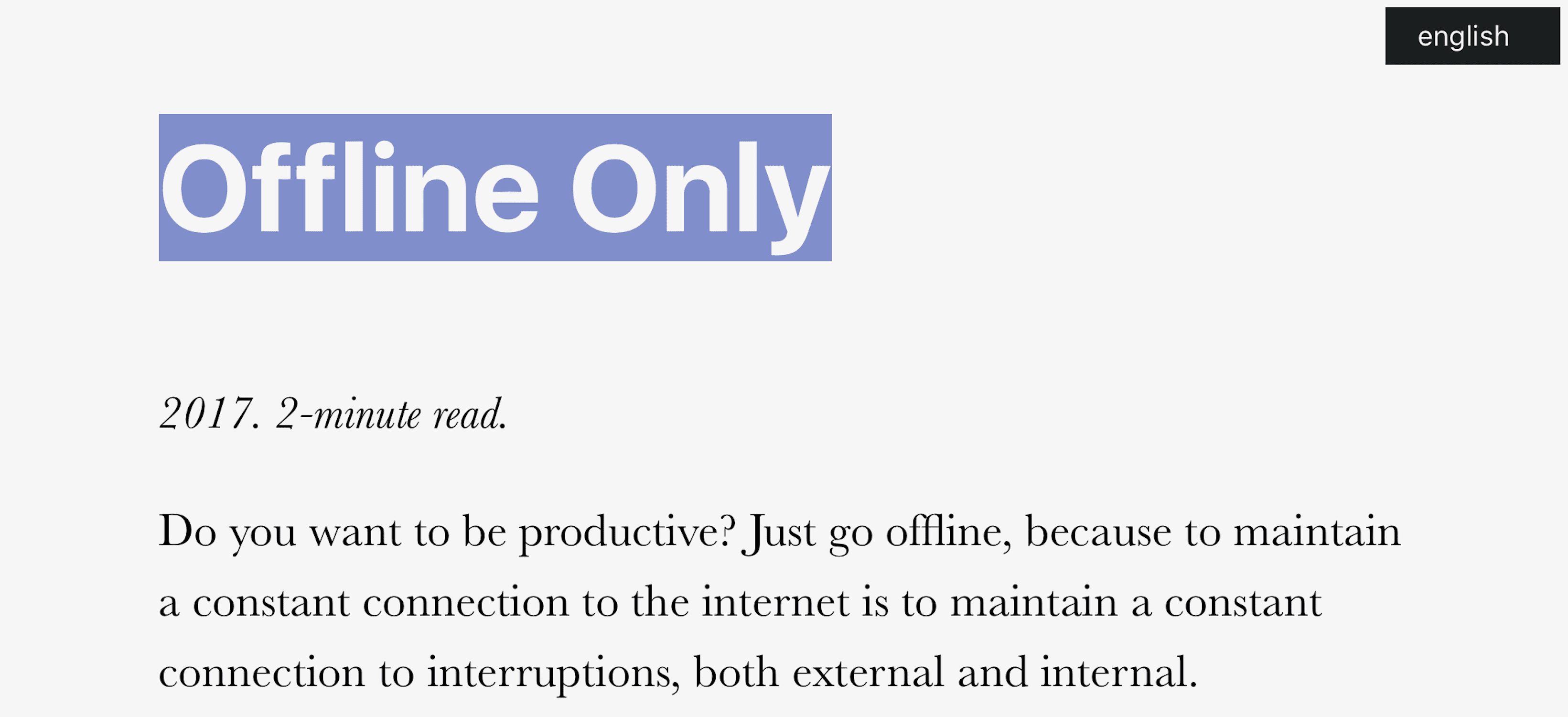
4. chris.bolin.co

brutalist websites

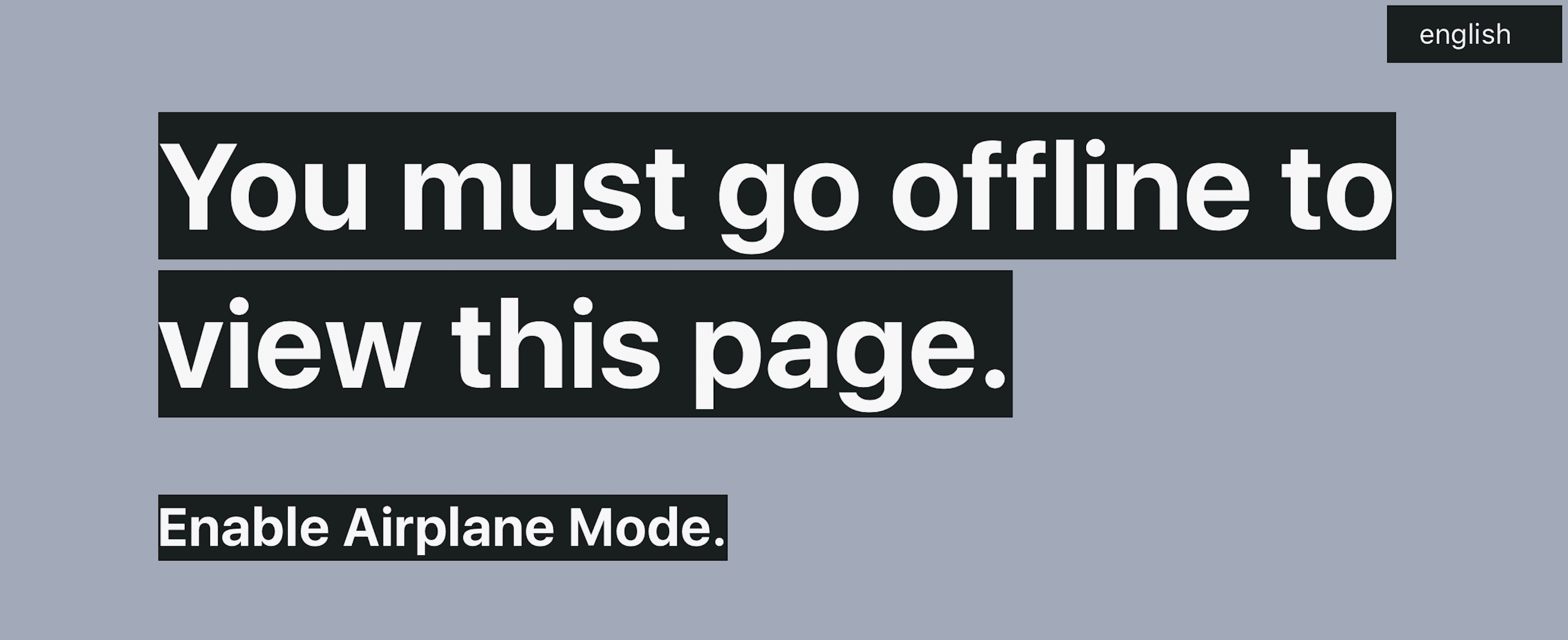
Have you ever seen an offline website? No? Me, either. And then I found this beauty.

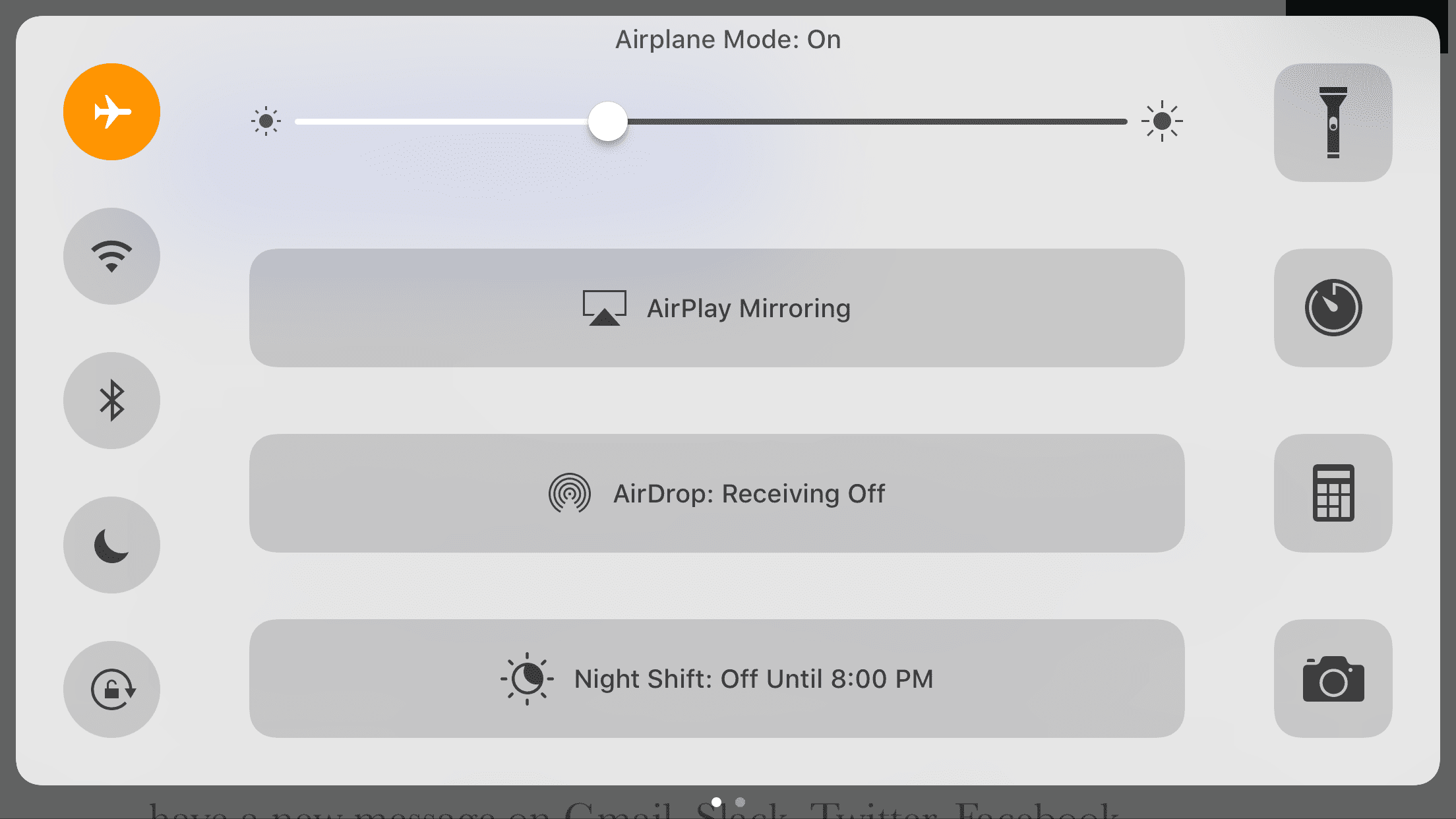
Chris Bolin designed this site to be as brutal to web users as possible: you gotta disconnect to connect. Automagically, the content appears, and you see a simple message about simplicity presented simply.

Brutalism, man.

brutalist websites

brutalist websites

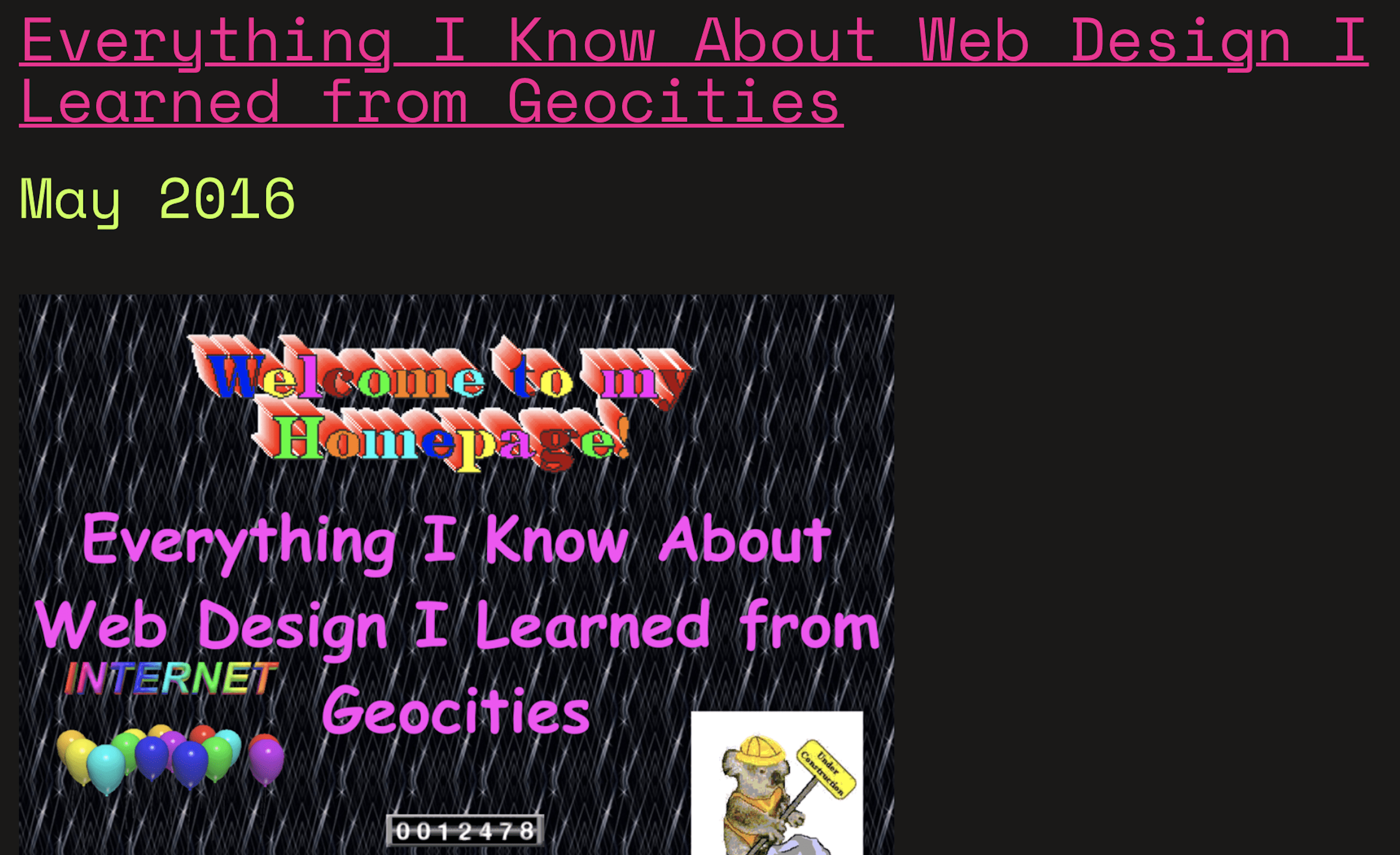
4. http://ift.tt/2yDUMUm

brutalist websites

One of her talks (and the way I became acquainted with her work) is called Everything I Learned about Web Design, I Learned from Geocities.

I don’t think I need to say anything else.

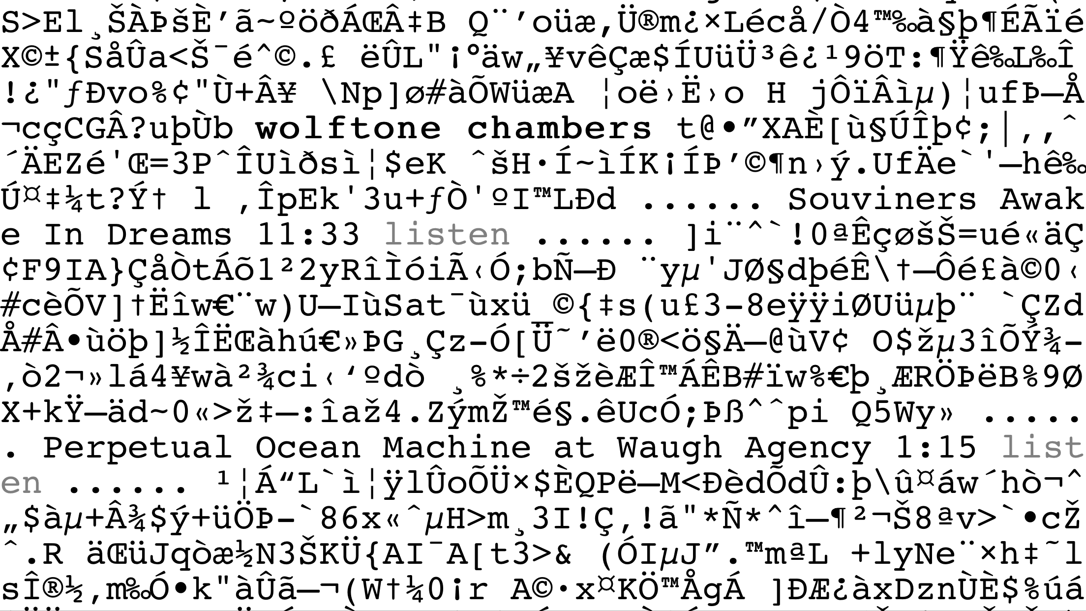
5. wolftonechambers.com

brutalist websites

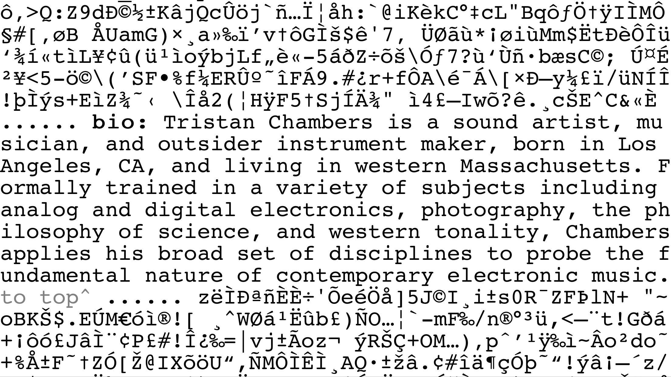
Talk about brutal. There is content here. Lots of it. Good info that’s well written. But it’s all but hidden from us by a sea of ASCII.

You can’t say this is visually appealing, nor is it terribly functional. But it’s memorable. It’s strangely clean despite all the clutter, and the weirdest part is that after you scroll a bit, you do see how it works and how to find info with no directions. Which means that, again weirdly, this is how UX should work.

#shrugemoji

brutalist websites

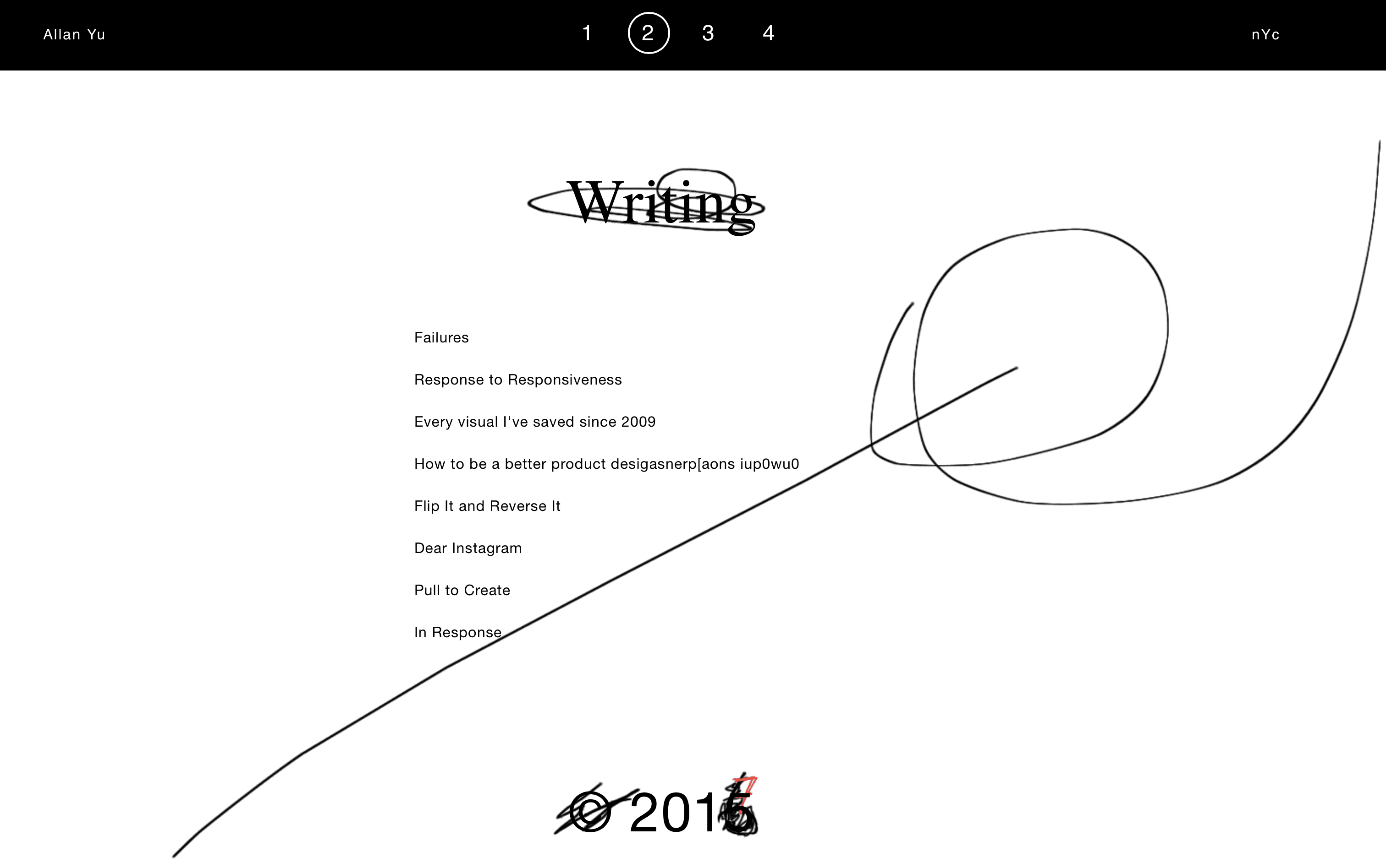
6. allanyu.nyc

brutalist websites

Part of the beauty of writing and publishing on the web is that your users don’t see the revisions and changes you make to your stuff. You can put new content out there or adjust old content, and no one will be the wiser (unless they check Wayback Machine archives).

Allan Yu, though, uses brutalism to show the revisions he makes to his site as though they’re physical revisions in a notebook. It makes the overall experience less clean overall, but the messiness adds to the user experience so everyone is aware that he not only grows in style, but ability and creativity.

Not a design you’d find on a major news outlet (wouldn’t it just be fun to see editorial marks on CNN?), but for a designer or agency who has relatively slow updates, this style would probably work well.

7. Brutalist Redesigns

brutalist websites

Making brutalist websites is far, far harder than you’d think. Because it’s easy to make a website ugly. It’s also easy to make a website simple. And it’s easy to make a website look dated.

But it’s hard to do all of those at once. So Pierre Buttin took some of the cleanest, most popular apps (like Facebook and Instagram and Snapchat) and redesigned them as examples of how you can maintain form and function while removing superfluous flash that adds nothing to the experience.

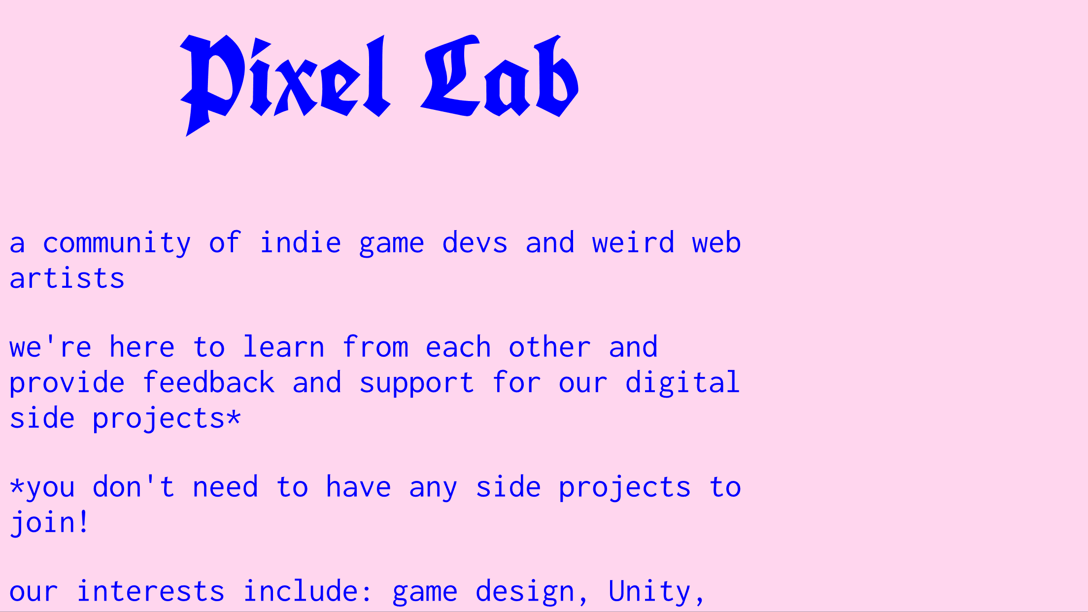
8. morgane.com/pixel- lab

brutalist websites

http://ift.tt/2yF47eP
(Maybe new pics on laptop of whole page.)

Indie video game developers are a quirky bunch. The folks at Pixel Labs don’t stray from that description. Their website is a single page that looks like it was written in the early ’90s, and the color palette probably was.

That said, they know what they’re doing. They have a showcase of their work, an invite to their Slack server, and a desire to help other people.

Their use of web design removes any obstacles between them and their audience.

9. wekflatm.kr

brutalist websites

I think this may be the perfect website. Seriously. I’m seriously considering making the page showcasing my novels work like this.

It’s ecommerce at its most fundamental and perfect: Here’s a chair. Buy it. Want a sofa? Okay. You can buy them over there.

No wish lists, no searches, no variations or user reviews. Just item, price, buy.

It ain’t pretty, but it ain’t ugly, either. It’s simple. And it has personality. It’s everything you need in a website and nothing you don’t.

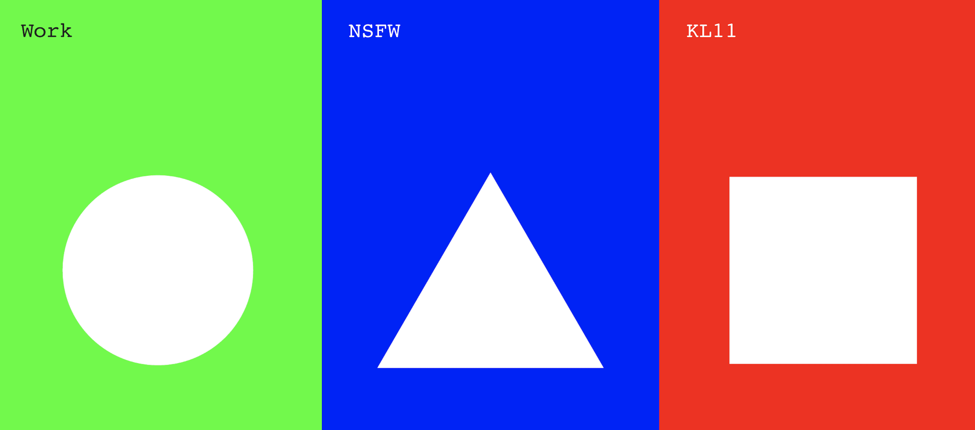
10. keyaar.in

brutalist website

I bet the first thing you’d do on this site is click a shape. Because shapes. Then you’ll read the labels–which don’t really tell you much.

Thing is, though, you know pretty much what each one is when you click it. Work is a gallery of, you guessed it, work. NSFW is a blog, but even before that, you know you’re getting into something personal, if not intimate. And KL11? The design agency themselves. All the info you need is there.

What more do you people want out of a website?

Brutal, shmutal

You may not want a suite of brutalist websites in your portfolio. That’s fine. This design scheme is absolutely not for everyone, and some clients are sure to balk when you pitch an ugly site.

But there are lots of design lessons you can learn from these sites.

I do challenge you, though, to try to make a brutalist site. Boiling the whole thing all the way down to the essentials will make you confront your preconceptions, as well as your strengths and weaknesses. Sure, it’ll be brutal, but you’ll come out of it a stronger designer.

And maybe a stronger person, too.

What do you think about brutalist websites? Let us know your thoughts on this trend in the comments

Article thumbnail by Kaleo / shutterstock.com

The post 10 Brutalist Websites to Inspire Your Next Web Design Project appeared first on Elegant Themes Blog.

from Elegant Themes Blog http://ift.tt/2yFasqi
via IFTTT

How To Participate In Digipo (September 2017 version)

How To Participate In Digipo (September 2017 version)

Every time I say I can’t make it easier to participate in Digipo, I find a way to make it easier.

The current process involves no skills greater than knowing how to work a word processor, and (more importantly) allows students to participate anonymously if they wish, without having to sign up for Google accounts or have edits tracked under pseudonyms. We accomplish this through a Microsoft Word template and by submitting the files into public domain.

You can of course use a more complex process, sign your name to the article, and use Google Docs as your central tool. Depending on your needs and skill level you may want to do that. It’s just not required anymore.

Here’s the steps.

  1. Read (at least some) of the book.
  2. Pick a question to investigate from our list of 300+ questions, or make up your own.
  3. Have your students download this Microsoft Word template that guides them through an investigation of a question. Apply the skills from the book.
  4. Do whatever sort of grading, assessment, or feedback you want.
  5. Take student reports where the students have agreed to submit them into public domain, and zip up the word documents. Mail them to michael.caulfield@wsu.edu. Make sure you introduce who you are, what the class is about, and a bit about your experience as I do not open zip files from random people. Also give me a blurb about how your class would like to be identified on the site (they have the option  of remaining anonymous too). For verification purposes, send it from your university account. I may email back to verify.
  6. I’ll put them on the Digipo site in a subdirectory with a bit about your class and give you a password that allows them to edit online going forward.
  7. At a later point we’ll assemble a small panel of professors who will go through the student work and choose ones to “promote” to the main directory based on quality. The key question reviewers will ask is whether the document provides better information than at least one of the top ten Google results for the question.

That’s it!


from Hapgood http://ift.tt/2fpamYN
via IFTTT

The History of the Future of Learning Objects and Intelligent Machines

This talk was delivered at MIT for Justin Reich’s Comparative Media Studies class “Learning, Media, and Technology.” The full slide deck is available here.

Thank you for inviting me to speak to your class today. I’m really honored to be here at the beginning of the semester, as I’m not-so-secretly hoping this gives me a great deal of power and influence to sow some seeds of skepticism about the promises you all often hear – perhaps not in this class, to be fair, as in your other classes, in the media, in the world at large – about education technology.

Those promises can be pretty amazing, no doubt: that schools haven’t changed in hundreds if not thousands of years and that education technology is now poised to “revolutionize” and “disrupt”; that today, thanks to the ubiquity of computers and the Internet (that there is “ubiquity” is rarely interrogated) we can “democratize,” “unbundle,” and/or “streamline” the system; that learning will as a result be better, cheaper, faster.

Those have always been the promises. Promises largely unfulfilled.

It’s important – crucial even – that this class is starting with history. I’ve long argued that ignorance of this history is part of the problem with education technology today: that its promises of revolution and innovation come with little to no understanding of the past – not just the history of what technologies have been adopted (or have failed to be adopted) in the classroom before, but the history of how education itself has changed in many ways and in some, quite dramatically, with or without technological interventions. (I’d add too that this is a problem with tech more broadly – an astounding and even self-congratulatory ignorance of the history of the industries, institutions, practices folks claim they’re disrupting.)

I should confess something here at the outset of my talk that’s perhaps a bit blasphemous. I recognize that this class is called “Learning, Media, and Technology.” But I’m really not interested in “learning” per se. There are lots of folks – your professor, for starters – who investigate technology and learning, who research technology’s effect on cognition and memory, who measure and monitor how mental processes respond to tech, and so on. That’s not what I do. That’s not what my work is about.

It’s not that I believe “learning” doesn’t matter. And it’s not that I think “learning” doesn’t happen when using a lot of the ed-tech that gets hyped – or wait, maybe I do think that.

Rather, I approach “learning” as a scholar of culture, of society. I see “learning” as a highly contested concept – a lot more contested than some researchers and academic disciplines (and entrepreneurs and journalists and politicians) might have you believe. What we know about knowing is not settled. It never has been. And neither neuroscience nor brain scans, for example, move us any closer to that. After all, “learning” isn’t simply about an individual’s brain or even body. “Learning” – or maybe more accurately “learnedness” – is a signal; it’s a symbol; it’s a performance. As such, it’s judged by and through and with all sorts of cultural values and expectations, not only those that we claim to be able to measure. What do you know? How do you know? Who do you know? Do you have the social capital and authority to wield what you know or to claim expertise?

My work looks at the broader socio-political and socio-cultural aspects of ed-tech. I want us to recognize ed-tech as ideological, as a site of contested values rather than a tool that somehow “progress” demands. Indeed, that’s ideology at work right there – the idea of “progress” itself, a belief in a linear improvement, one that’s intertwined with stories of scientific and technological advancement as well as the advancement of certain enlightenment values.

I’m interested not so much in how ed-tech (and tech more broadly) might change cognition or learning, but in how it will change culture and power and knowledge – systems and practices of knowing. I’m interested in how ed-tech (and tech more broadly) will change how we imagine education – as a process, as a practice, as an institution – and change how we value knowledge and expertise and even school itself.

I don’t believe we live in a world in which technology is changing faster than it’s ever changed before. I don’t believe we live in a world where people adopt new technologies more rapidly than they’ve done so in the past. (That is argument for another talk, for another time.) But I do believe we live in an age where technology companies are some of the most powerful corporations in the world, where they are a major influence – and not necessarily in a positive way – on democracy and democratic institutions. (School is one of those institutions. Ideally.) These companies, along with the PR that supports them, sell us products for the future and just as importantly weave stories about the future.

These products and stories are, to borrow a phrase from sociologist Neil Selwyn, “ideologically-freighted.” In particular, Selwyn argues that education technologies (and again, computing technologies more broadly) are entwined with the ideologies of libertarianism, neoliberalism, and new forms of capitalism – all part of what I often refer to as the “Silicon Valley narrative” (although that phrase, geographically, probably lets you folks here at MIT off the hook for your institutional and ideological complicity in all this). Collaboration. Personalization. Problem-solving. STEM. Self-directed learning. The “maker movement.” These are all examples of how ideologies are embedded in ed-tech trends and technologies – in their development and their marketing. And despite all the talk of “disruption”, these mightn’t be counter-hegemonic at all, but rather serve the dominant ideology and further one of the 21st century’s dominant industries.

I want to talk a little bit today about technology and education technology in the 20th century – because like I said, history matters. And one of the ideological “isms” that I think we sometimes overlook in computing technologies is militarism. And I don’t just mean the role of Alan Turing and codebreakers in World War II or the role of the Defense Department’s Advanced Research Projects Agency in the development of the Internet (although both of those examples – cryptography and the Internet – do underscore what I mean when I say infrastructure is ideological). C3I – command, control, communications, and intelligence. Militarism, as an ideology, privileges hierarchy, obedience, compliance, authoritarianism – it has shaped how our schools are structured; it shapes how our technologies are designed.

The US military is the largest military in the world. That also makes it one of the largest educational organizations in the world – “learning at scale,” to borrow a phrase from this course. The military is responsible for training – basic training and ongoing training – of some 1.2 million active duty soldiers and some 800,000 reserve soldiers. That training has always been technological, because soldiers have had to learn to use a variety of machines. The military has also led the development and adoption of educational technologies.

Take the flight simulator, for example.

One of the earliest flight simulators – and yes, this predates the Microsoft software program by over fifty years, but postdates the Wright Brothers by only about twenty – was developed by Edwin Link. He received the patent for his device in 1931, a machine that replicated the cockpit and its instruments. The trainer would pitch and roll and dive and climb, powered by a motor and organ bellows. (Link’s family owned an organ factory.)

Although Link’s first customers were amusement parks – the patent was titled a “Combination training device for student aviators and entertainment apparatus” – the military bought six in June of 1934, after a series of plane crashes earlier that year immediately following the US Army Air Corps’ takeover of US Air Mail service. Those accidents had revealed the pilots’ lack of training, particularly under night-time or inclement weather conditions. By the end of World War II, some 500,000 pilots had used the “Link Trainer,” and flight simulators have since become an integral part of pilot (and subsequently, astronaut) training.

(There’s a good term paper to be written – you are writing a term paper, right? – about the history of virtual reality and the promises and presumptions it makes about simulation and learning and experiences and bodies. But mostly, I’d argue if I were writing it, that much of VR in classrooms today does not have its origins the Link Trainer as much as in the educational films that you read about in Larry Cuban’s Teachers and Machines. But I digress.)

The military works along a different principle for organizing and disseminating knowledge than does, say, the university or the library. The military is largely interested in teaching “skills.” Or perhaps more accurately, this is how military training is largely imagined and discussed: “skills training.” (Officer training, to be fair, is slightly different.) The military is invested in those skills – and in the teaching of those skills – being standardized. All this shapes the kinds of educational software and hardware that gets developed and adopted.

One of the challenges the military has faced, particularly in the twentieth century, is helping veterans to translate their skills into language that schools and civilian hiring managers understand. This is, of course, the origin of the GED test, which was developed during WWII as a way to assess whether those soldiers who’d dropped out of high school in order to enlist had attained high-school level skills – to demonstrate “competency” rather than rely on “seat time,” to put this in terms familiar to educational debates today. There has also been the challenge of translating skills within the military itself – say, from branch to branch – and within and across other federal agencies. New technologies, to a certain extent, have complicated things by introducing often incompatible software systems in which instruction occurs. And at the end of the day, the military demands regimentation, standardization – culturally, technologically.

I just want to lay out an abbreviated timeline here to help situate some of my following remarks:

I’m not suggesting here that the Web marks the origins of ed-tech. Again, you’ve read Larry Cuban’s work; you know that there’s a much longer history of teaching machines. But in the 1990s, we did witness a real explosion in not just educational software, but in educational software that functioned online.

In January of 1999, President Clinton signed Executive Order 13111 – “Using Technology To Improve Training Opportunities for Federal Government Employees.” Here’s the opening paragraph, which I’m going to read – apologies – simply because it sounds as though it could be written today:

Advances in technology and increased skills needs are changing the workplace at an ever increasing rate. These advances can make Federal employees more productive and provide improved service to our customers, the American taxpayers. We need to ensure that we continue to train Federal employees to take full advantage of these technological advances and to acquire the skills and learning needed to succeed in a changing workplace. A coordinated Federal effort is needed to provide flexible training opportunities to employees and to explore how Federal training programs, initiatives, and policies can better support lifelong learning through the use of learning technology.

One of the mandates of the Executive Order was to:

in consultation with the Department of Defense and the National Institute of Standards and Technology, recommend standards for training software and associated services purchased by Federal agencies and contractors. These standards should be consistent with voluntary industry consensus-based commercial standards. Agencies, where appropriate, should use these standards in procurements to promote reusable training component software and thereby reduce duplication in the development of courseware.

This call for standards – and yes, the whole idea of “standards” is deeply ideological – eventually became SCORM, the Sharable Content Object Reference Model (and one of the many acronyms that, if you work with education technology, will make people groan – and groan almost as much as a related acronym does: the LMS, the learning management system).

Indeed, SCORM and the LMS – their purposes, their histories – are somewhat inseparable. (And I want you to consider the implications of that: that the demands of the federal government and the US military for a standardized “elearning” experience has profoundly shaped one of the foundational pieces of ed-tech that is used today by almost all colleges and increasingly even K–12 schools.)

The SCORM standard was designed, in part, to make it possible to easily move educational content from one learning management system to another. Among the goals: reusability, interoperability, and durability of content and courses. (I’m not going to go into too much technical detail here, but I do want to recognize that this did require addressing some significant technical challenges.) SCORM had three components: content packaging, runtime communications, and course metadata. The content packaging refers to the packaging of all the resources needed to deliver a course into a single ZIP file. The runtime communications includes the runtime commands for communicating student information to and from the LMS, as well as the metadata for storing information on individual students. And the course metadata, obviously, includes things like course title, description, keywords, and so on. SCORM, as its full name implies, served to identify “sharable content objects” – that is the smallest unit in a course that contains meaningful learning content by itself – content objects that might be extracted and reused in another course. The third version of SCORM, SCORM 2004, also introduced sequencing, identifying the order in which these content objects should be presented.

The implications of all this are fairly significant, particularly if we think about the SCORM initiative as something that’s helped, almost a decade ago, to establish and refine what’s become the infrastructure of the learning management system and other instructional software, as something that’s influenced the development as well of some of the theories of modern instructional design. (Theory is, of course, ideology. But, again, so is infrastructure.) The infrastructure of learning software shapes how we think about “content” and how we think about “skills” and how we think about “learning.” (And “we” here, to be clear, includes a broad swath of employers, schools, software makers, and the federal government – so that’s a pretty substantial “we.”)

I will spare you the details of decades worth of debates about learning objects. It’s important to note, however, that there are decades of debate and many, many critics of the concept – Paulo Freire, for example, and his critique of the “banking model of information.” There are the critics too who argue for “authentic,” “real-world” learning, something that almost by definition learning objects – designed to move readily from software system to software system, from course to course, from content module to content module, from context to context – can never offer. I’d be remiss if I did not mention the work of open education pioneer David Wiley and what he has called the “reusability paradox,” which to summarize states that if a learning object is pedagogically useful in a specific context, it will not be useful in a different context. Furthermore, the most decontextualized learning objects are reusable in many contexts, but those are not pedagogically useful.

But like I said at the outset, in my own line of inquiry I’m less interested in what’s “pedagogically useful” than I am in what gets proposed by industry and what becomes predominant – the predominant tech, the predominant practice, the predominant narrative, and so on.

Learning objects have been blasted by theorists and practitioners, but they refuse to go away. Why?

The predominant narratives today about the future of learning are all becoming deeply intertwined with artificial intelligence. We should recognize that these narratives have been influenced by decades of thinking in a certain way about information and knowledge and learning (in humans and in machines): as atomized learning objects and as atomized, standardized skills.

There’s a long history of criticism of the idea of “intelligence” – its origins in eugenics; its use as a mechanism for race- and gender-based exclusion and sorting. It’s a history that educational psychology, deeply intertwined with the development of measurements and assessments, has not always been forthright about. Education technology, with its origins in educational psychology, is implicated in this. And now we port this history of “intelligence” – one steeped in racism and bias – onto machines.

But we’re also porting a history of “skills” onto machines as well. This is, of course, the marketing used for Amazon’s Alexa. Developers “build” skills. They “teach” skills to the device. And it’s certainly debatable whether many of these are useful at all. But again, that’s not the only way to think about teaching machines. Whether or not something is “pedagogically useful,” here are reasons why the stories about it stick. The narrative about AI and skills is something to pay attention to – particularly alongside larger discussions about the so-called “skills gap.”

from Hack Education http://ift.tt/2jvnUGS
via IFTTT

I’ll Take That Text Extra Large: Bigify It

Some people like to spend their long airplane time watching movies or playing phone games. That’s fine. Me, I usually sleep, but on my cross country flight yesterday I wanted to try building a little HTML/jQuery tool.

Because it’s something I can use this week.

Because I can (running in my laptop’s localhost).

Well almost. I lacked the internet to look up more of the code I got wrong. But I got about 80% there.

Presenting… Bigify. The thing it does?

There is a small form field at the bottom; whatever is typed or pasted there is “bigified” on the main display.

Stunning, eh?

I have a few days this week of hand on web workshops; I won’t be doing slides, mostly web demos. There is this part when I want to have everyone go to the same site, I will make shirt URLs, but still, it seems useful to display them as Big On Screen as Possible.

There are a number of jQuery code bits to dynamically resize text to a window size, I decided to try FitText, that is what I downloaded before my trip. I also made sure I had a local copy of jQuery as served by Google just so I could play while not connected.

There’s a lot of room for improvement; I wanted to make the form field disappear when not being edited, but the show/hide jQuery worked to hide, but never to show (same with CSS hover tricks, maybe it’s the absolute positioning??). Maybe it could use query parameters to save pre-configured strings as URLs. Maybe some options for different display colors (light text a black background for contrast??).

Got ideas? Fork this thing!

Who knows? I have a flight home Wednesday, maybe I will do an update.

Update

Thank for John Johnston or forking and putting into play better interface- a form field element that replaces the display text, so it feels like editing it right in place.

SOme more tweaks coming output, but this now uses a better fonf on mobile devices (I hope).


Featured Image: Large Order Of Toast flickr photo by JD Hancock shared under a Creative Commons (BY) license

from CogDogBlog http://ift.tt/2w4GutU
via IFTTT

Visualizing future trends for education and technology

With the help of Future Trends in Technology and Education friends and Patreon supporters, we now have a first FTTE infographic.

The idea was to organize all of the 85+ trends the report tracks into a single image. This first design is aimed at appearing as one page, such as for a workshop handout.

FTTE visualization

The heart of it is the group of three main columns, which contain the bulk of FTTE content.  The very top contains the higher ed crisis or bubble trends; they appear up there because they rest on other trends, like pillars.  I showed the connection between specific technologies as they appear in the world and their educational instances (3d printing, digital video, etc) by aligning them up within a colored box.

Each trend contains countervailing trends as well.

Later I’d like to edit and compress it down to smaller sizes, as for a card.  That would most likely involve combining trends into rubrics or mega-trends, like piling VR, AR, and MR together.  I can also turn this into an interactive object, with links from each trend.

What do you think?

from Bryan Alexander http://ift.tt/2ubmINB
via IFTTT